This site is built using the Hugo static site generator. Hugo is awesome. Its documentation is not. That is my personal opinion :) This post explains why I find the existing documentation so frustrating and how it could be improved.
Context and background
First things first: Hugo does have a ton of useful documentation. I am glad it exists. *Insert valid statements here about how Hugo is an open source project.. we should be grateful that the docs even exist.. that users should step up and contribute to improving the docs.. etc. * This is a well-intentioned critique for improving the quality of the existing documentation.
Secondly: It is possible that most Hugo users are far more knowledgeable, or patient, than I am and therefore have not faced any of the issues described below. Web development is not my forte. I occasionally dabble with it as a hobby, for example when creating a site such as this one. In the past, I have self-hosted and used Joomla, Drupal, Wordpress, Octopress, Pelican, and Grav. Never anything particularly fancy though and I am not an expert. With that out of the way, let’s dive in and look at two problematic patterns.
Problematic patterns
Pattern 1: Reading a page of Hugo documentation from top-to-bottom for the first time rarely helps me understand a concept or get particular answers. More often, as soon as I start reading something, it becomes necessary to branch off and first read about a different-but-related concept. Recursively. Start reading page A and after barely a paragraph, it’s necessary to jump to page B. Once on page B, need to jump to page C almost immediately. And so on. Soon, I’d be on page Q, while trying to hold all the partially read states of pages A through P in my head and trying to understand something on page Q without forgetting my original pursuit. Worse, the first paragraphs of some page M would point to page N, whose first paragraphs in turn would point back to page M resulting in a circular dependency. The end result is that I’d need to read a whole bunch of pages while barely understanding anything during the first reading and with the number of unresolved questions continuously increasing in my mind. Only after reading a lot of pages and ruminating over them simultaneously would the content of any one page start making sense.
Pattern 2: Within a documentation page, new concepts or terms are sometimes introduced without clearly stating what they are or how they relate to the current topic. This makes it seem like the documentation has suddenly switched to some arbitrarily different topic. Of course, this is not actually the case. It is just that the the new topic and its connection with the previous topic isn’t explicitly introduced.
A concrete example
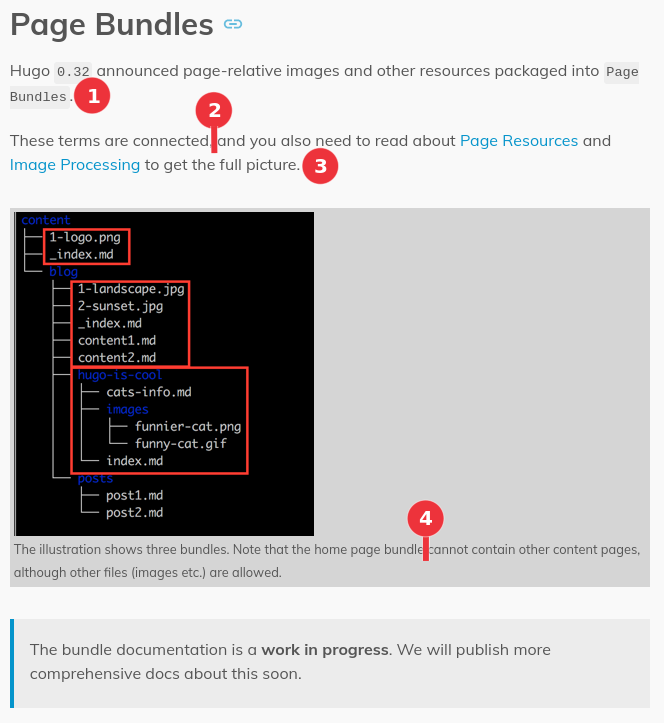
Let’s look at a concrete example of both these patterns in the documentation page describing Content Organization. This is a typical page that a total Hugo newbie would need to read. (Since the content of this page may evolve in future, this PDF is a static snapshot of what the page looks like at the time of writing this post.). Let’s be charitable and pretend that the reader is a conscentious person and has landed on this page after at least skimming the Getting Started part of the documentation. The view as you start reading the page is shown below.

At the locations of the numbered red circles, my thoughts are
- “..page-relative images and other resources packaged into
Page Bundles.” Okay, but what is a Page Bundle? - “These terms are connected…” Which terms??
- “..to get the full picture.” Full picture of what? Presumably of Page Bundles? Okay, I may have to read those two links (Page Resources and Image Processing) to fully understand this.
- “..Note that the home page bundle..” What “home page bundle”? Which one of the three red boxes in the picture is the home page bundle? The word ‘home’ does not appear anywhere in the picture.
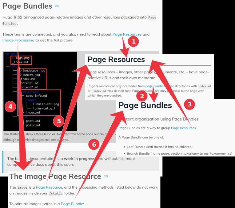
Note that at this point the reader still has no idea what a “Page Bundle” is, other than it is <something> which packages page-relative images and other resources. Looking at the screenshot, it could perhaps indirectly be inferred that a Page Bundle is a folder/directory that has some content? But that is not explicitly mentioned anywhere. Okay, let’s pause reading this page and go click on those two links. The image below shows what happens when you do that.

- The Page Resources page states that “Page resources are only accessible from page bundles, those directories with
index.mdor_index.mdfiles at their root.” Great! So the hypothesis that a Page Bundle is a regular directory with some special content seems to be true. BUT.. to really know what a Page Bundle is, you now need to jump to the linked page about Page Bundles. - The Page Bundles page starts off by telling you that, “Page Bundles are a way to group Page Resources.” So hey, that’s a link back to the page we came from. At this point, we still don’t really understand what a Page Bundle is.. nor have we yet understood what Page Resources are. So maybe read this page, the previous page on Page Resources, and the original page we started from, to understand everything? But wait, we have not yet visited the Image Processing, which is one more unknown concept. Let’s do that first.
- Visit the Image Processing page. Literally the first line links to the Page Resource page and the second line links to the Page Bundle page.
Note that dense interlinking of material is actually good. The fact that these pages all link to each other is good! The problem is that the pages make no attempt to be even partially self-contained with links pointing to optional extra/in-depth material the reader may wish to read. Rather, pursuing those links is absolutely necessary to even start understanding what the page is about. The closest programming analogy I can think of is a nested chain of functions: Function A calls Function B which calls Function C etc. and the program flow needs to go down that function chain and then back up before the original Function A finishes execution. Similarly, with Hugo docs, if you start on Page A, you need to go to Page B, which then forces you to Page C etc. and you need to read them all (with some circular links amongst the pages) and then back-pedal all the way to Page A in order to understand what Page A is about. This is an exemplary instance of Pattern 1.
Note: The Content Organization page does state that “The bundle documentation is a work in progress…” The thing is, the Page Bundle documentation exists.. it’s just not referenced in the section on Page Bundles. But let’s continue reading.

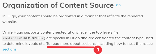
- “While Hugo supports content nested at any level, … .To read more about sections,..” Huh? What the heck is a “section”? How is a “section” related to what is being described? This page has literally never mentioned the word “section” so far and all of a sudden, seemingly with no reasoning, it is asking the reader to go to some other page to learn more about sections. This is an exemplary instance of Pattern 2. Yes, I could simply click the link and find out, but that’s going to be another rabbit hole. Let’s ignore this and continue reading the page.

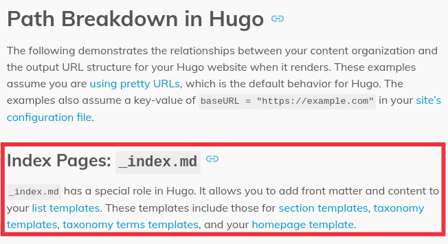
The documentation page now starts talking about a file named _index.md which has not been introduced before. The description of _index.md is that it “..has a special role in Hugo. It allows you to add frontmatter and content to your list templates. These templates include those for section templates, taxonomy templates, taxonomy terms templates, and your homepage template.” Argh! At this point, to understand what _index.md is actually useful for, maybe you need to understand what a list template is and maybe even what ‘section’, ’taxonomy’, ’taxonomy terms’ and ‘homepage’ templates are. The documentation has basically asked the user to read up on five new terms in order to understand what _index.md is useful for.
How to improve?
- Pattern 1: It is not feasible, nor advisable, to make every page perfectly self-contained. However, if Page A mentions a concept that is described in-depth on Page B, it helps immensely if Page A briefly describes the concept so that the reader can avoid jumping to Page B. The reader can subsequently go to Page B for better understanding, but need not break immersion in Page A’s content. The Hugo docs actually do this in some places, but not uniformly or consistently. For example, the Page Resources page briefly describes what page bundles are ("..those directories with
index.mdor_index.mdfiles at their root."). Those 10 words are probably sufficient at that point. - Pattern 2: This is a particularly egregious error and there is no excuse for indulging in it. Just do.not. start using new terms/concepts arbitrarily within a paragraph without introducing them first. Failing that, at least have a ‘Prerequisite Reading’ Section upfront.
- Calibrate to your readers: In general, Hugo’s documentation seems to be written by skilled and experienced programmers for skilled and experienced users. If you already know a swathe of underlying concepts, then the documentation serves as an excellent reference. I don’t know if the authors intended for it to be this way though. Rather that it is easy for experienced folks to forget what it feels like to be a newbie and this is reflected in their writing. It takes deliberate effort to read what you’ve written with the eyes of a newbie.
- Many projects structure their documentation into ‘Getting Started’, ‘User guide’, and ‘Reference’ with each being gentler than the subsequent one. Perhaps Hugo could adopt a similar model. Getting Started already exists.
- There are many excellent blog posts documenting various aspects of Hugo and its quirks. Could it be that the authors passionate enough to write and share those posts would help with Hugo’s documentation e.g. sections/chapters in a User Guide, if the barriers for doing so are sufficiently low?
In a sense, both patterns are violations of one and the same principle of good technical writing: Given information comes before new. This principle is described and illustrated in this one page PDF file1. I claim that if writers adopt this one principle and no other, it nevertheless leads to a tremendous increase in readability (assuming you have solid content to begin with). Over the years, I have repeatedly observed the truth of this claim after asking students and colleagues to adhere to this one principle.
I have critiqued the first half of the Content Organization page in this post. The critique wouldn’t be complete if I do not share an example of what a better version of the page might look like. Such an example can be found in here. By making minor tweaks and adding a couple of explanatory lines, the content is arguably more newbie-friendly.
Does any of this matter?
Did I really get so pissed off after reading Hugo’s documentation that I needed to write a long rant to vent about it? Hmm, this seems to be the case :)
The thing is, after having spent a lot of time tinkering with Hugo, I have now assimilated enough knowledge that the existing Hugo docs make perfect sense…most of the time. Maybe this is the case with other users of Hugo too.
However, I still remember how frustrating it felt while reading the docs for the first time. Sometimes, I’d abandon reading the official docs and search for a blog post or tutorial that did a better job of explaining the concepts. Other times, I would re-open my search for a Hugo alternative or just turn my back on Hugo for days on end until I had the energy for a renewed attempt. It felt like the official Hugo docs were the last place I should look at if I wanted to learn how to do something with Hugo. It does not have to be like that. Hugo is awesome. This post is my tiny attempt to show how Hugo could be made more approachable/friendly for beginners.
-
This page is an excerpt from a course in Technical English I took at KTH years ago. All credit belongs to that course’s content creator. ↩︎